Typography, Illustration & Layout
The Goal
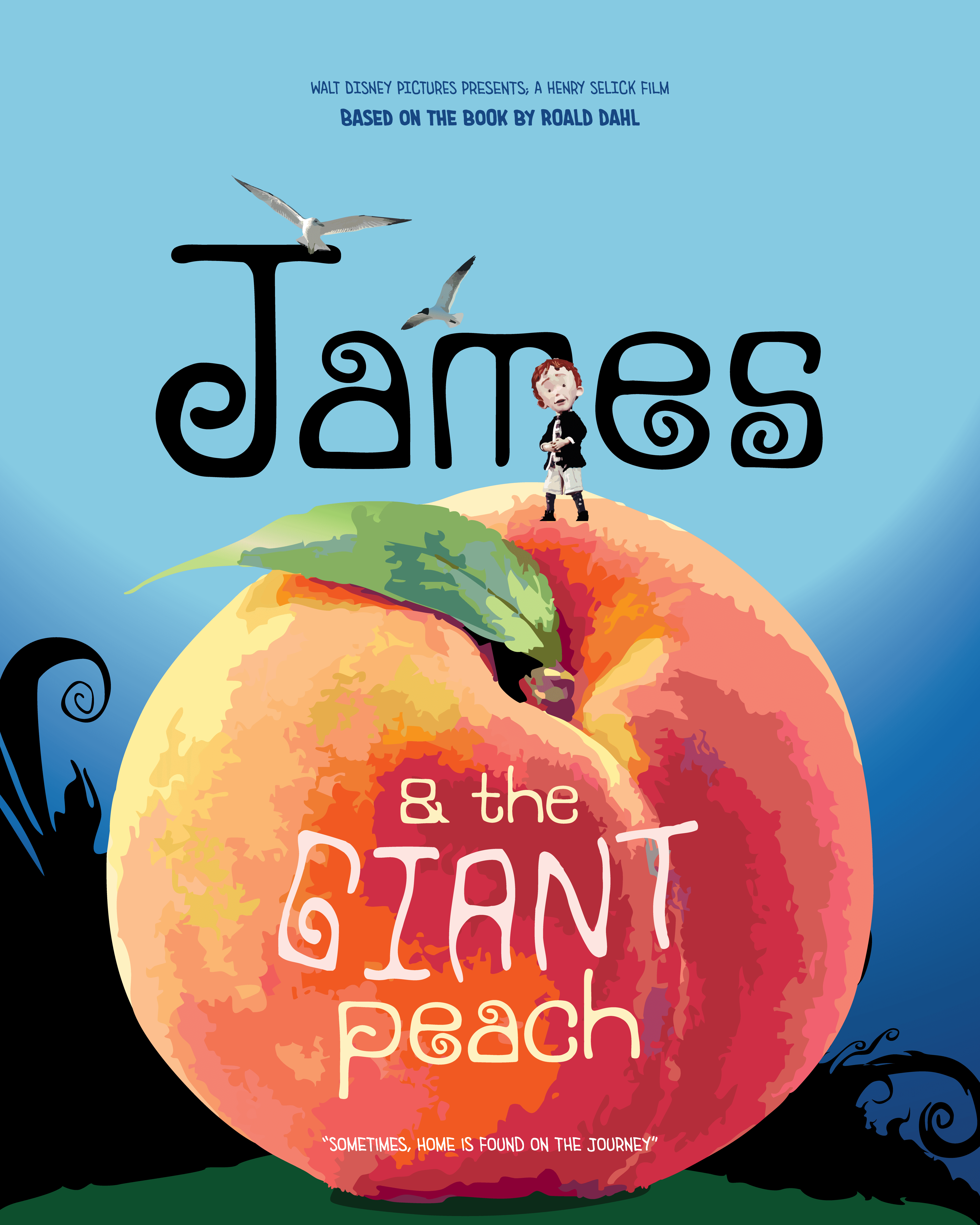
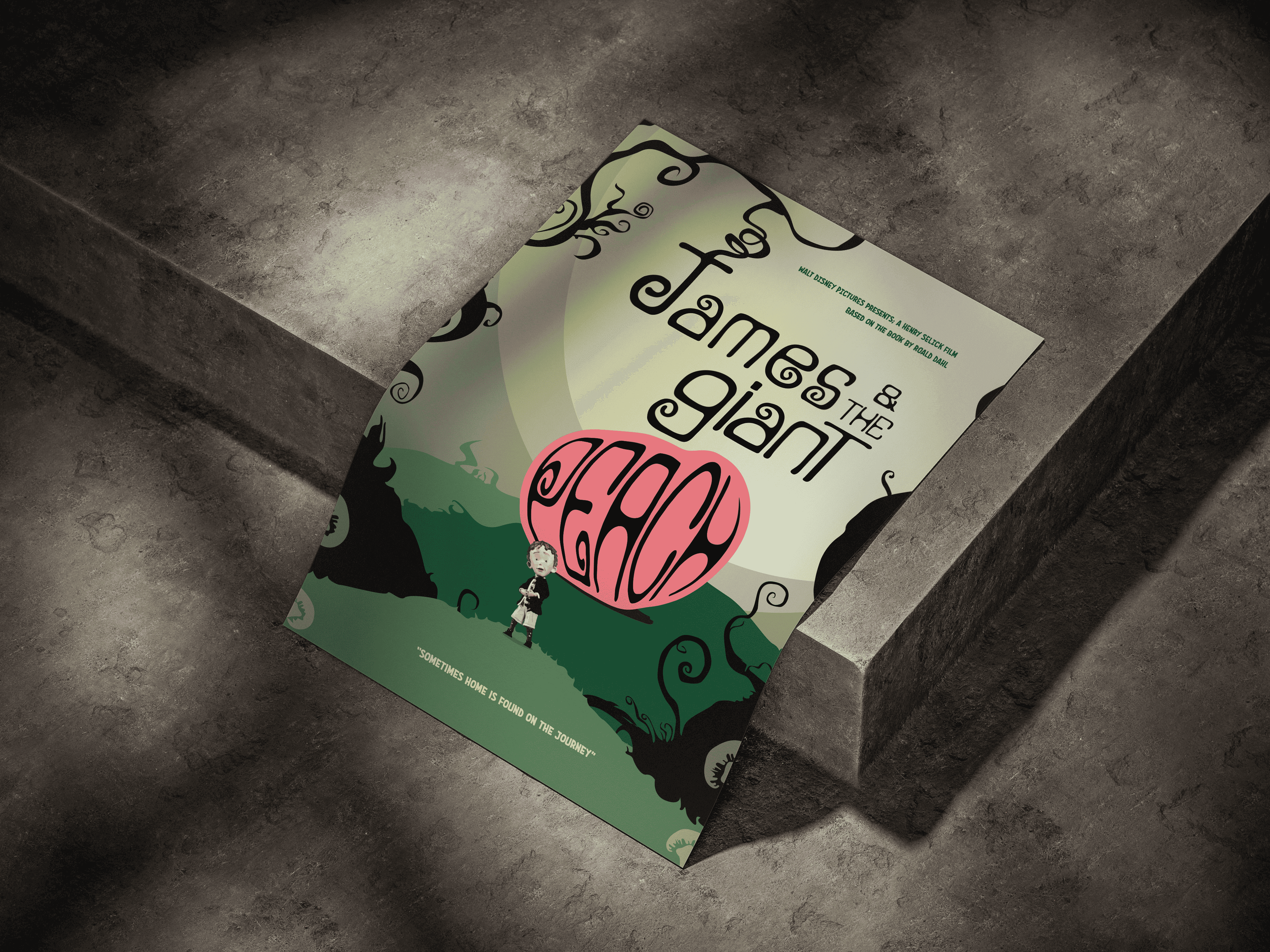
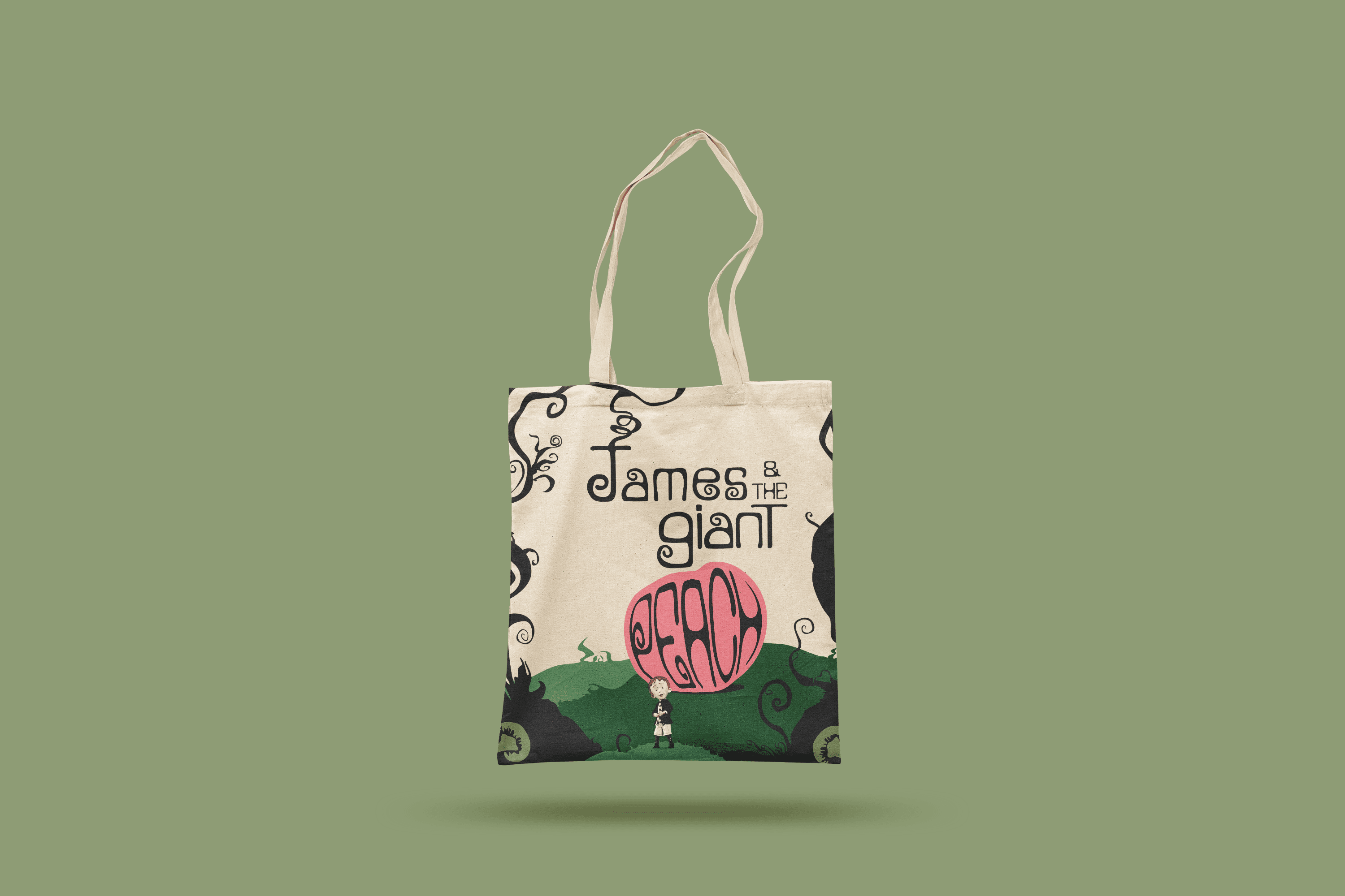
To design a custom font inspired by James & the Giant Peach, capturing the whimsically weird tone of the story and using that font on a movie poster design.
The Challenge
The biggest challenge was not being too literal. My professor encouraged me to think conceptually rather than literally, which helped me push my letterforms further. I had to find a way to visually reflect the emotional tone of the story without turning it into a decorative design.
The Process
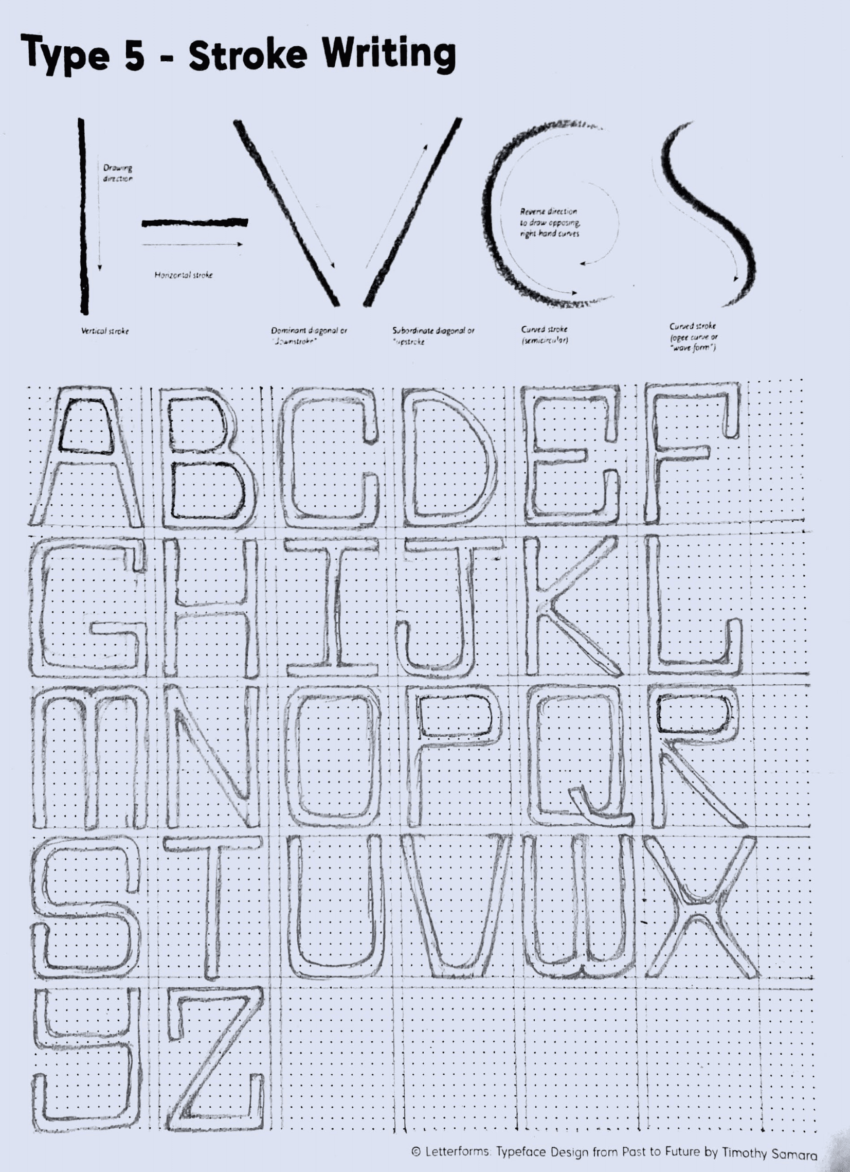
I went through several rounds of sketches and digital refinement, focusing on achieving balance between playfulness, whimsy and legibility. The poster design also reflects this balance. The typography takes center stage while the illustrated elements compliment it in communicating the vibe of the story.
The Takeaway
This project taught me that good typography design is about communicating emotion through structure, rhythm and form. I was also honoured to receive the Best Typography Design Award in my course.


