Branding, Illustration & Layout
The Challenge
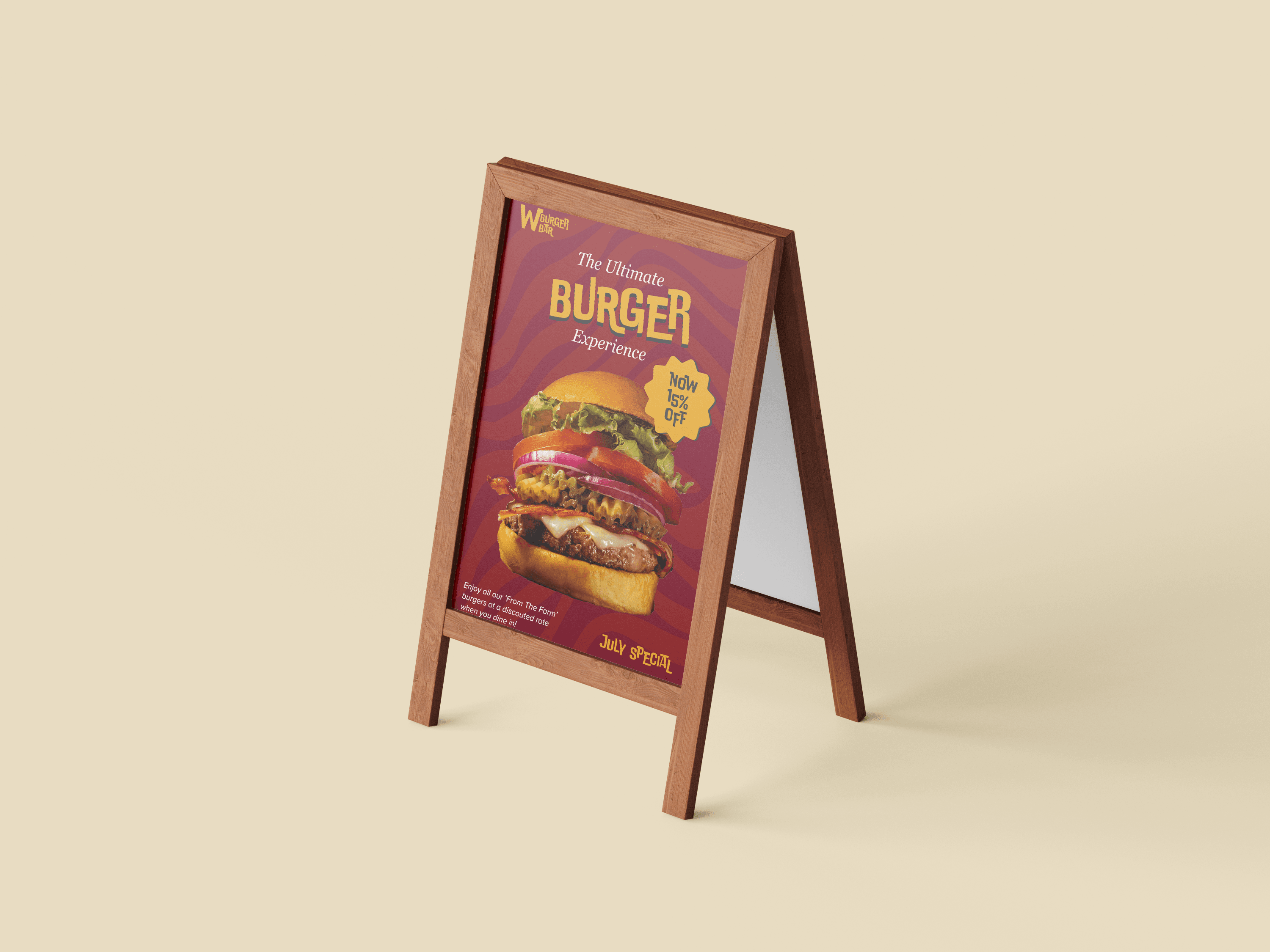
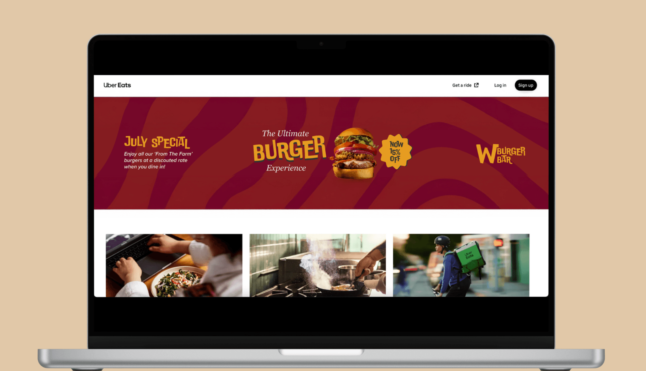
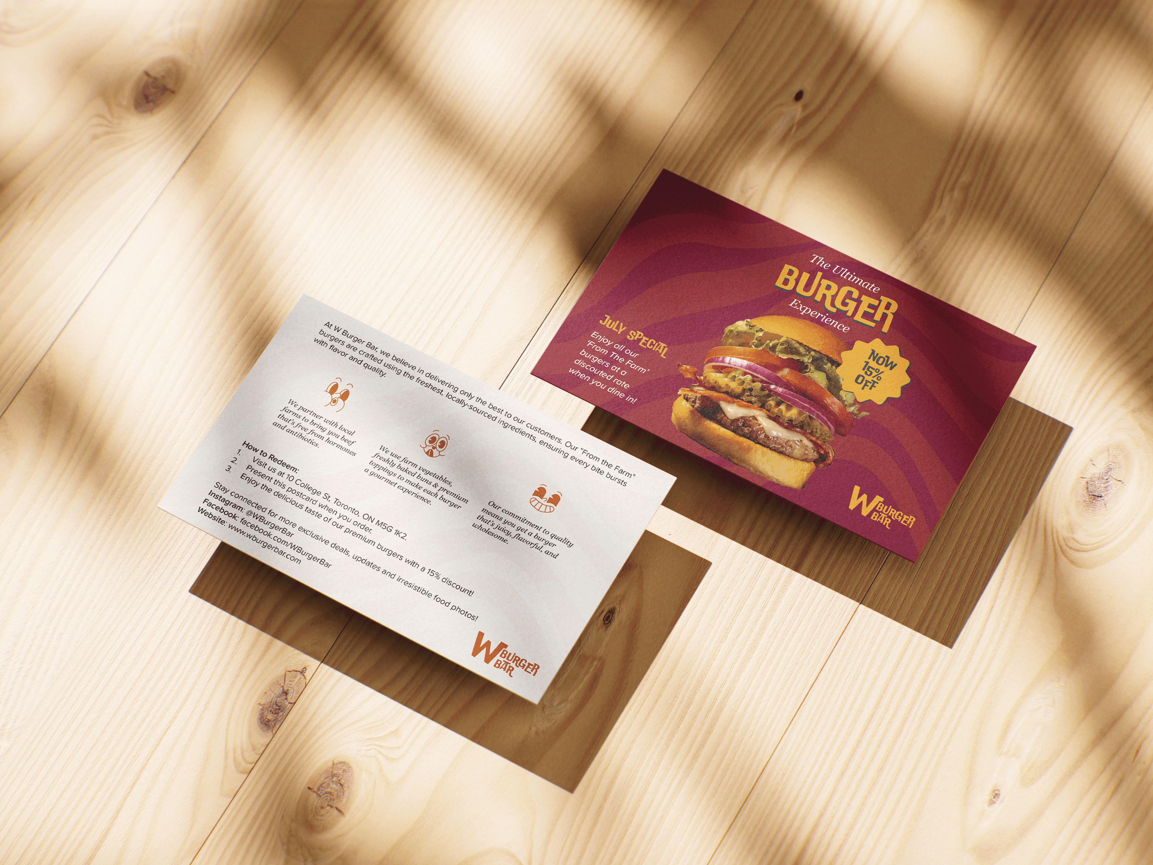
WBB’s existing branding lacked clarity and visual cohesion. The challenge was to design a new identity that stood out while reflecting the product and the atmosphere.
The Strategy
I started by defining the brand tone. I wanted it to be bold, playful and a little modern-rustic. I built the visual assets using contrast as a key element in both typography and color to reflect the sensory contrast in the food.
The Process
I chose a sharp, clean-lined typeface for the logo to cut through the visual “weight” of the burger imagery. The color palette was inspired by real burger ingredients. I also designed a pattern inspired by “sauce” lines, and emoticon-style illustrations to enhance packaging and any environmental graphics. Typeface pairings were selected to balance bold headlines with readable body copy.
The Takeaway
This project helped me understand how visual tone, typography, and details like a pattern, can come together to build a full brand experience.
Process Visuals